
Greenfood
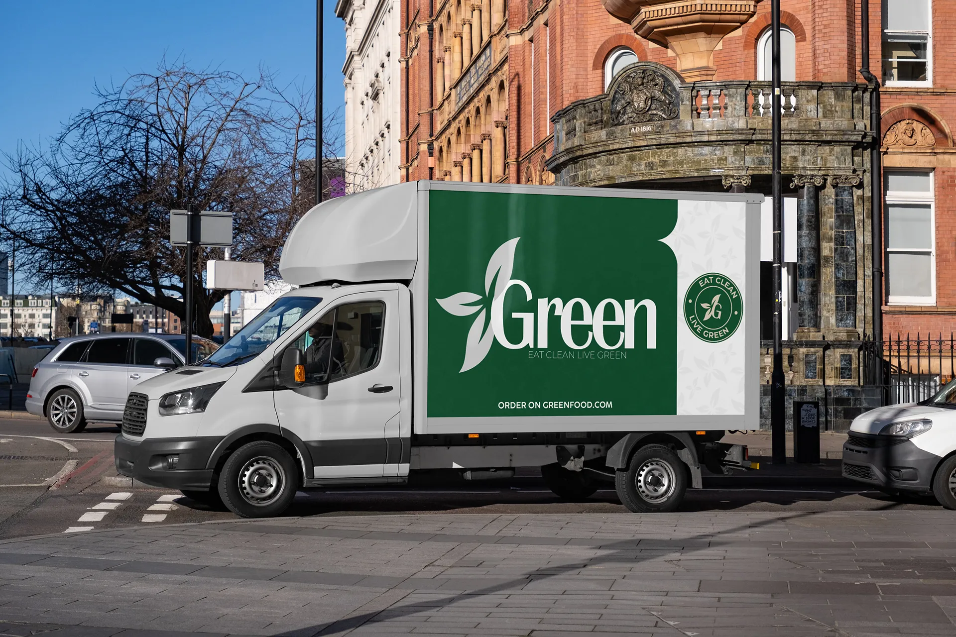
Visual identity and packaging for a healthy food brand.
- Client
- Greenfood
- Year
- 2025
- Services
-
Brand identity
Logotype
Packaging
Art direction
- Stack
-
Adobe Illustrator
Adobe Photoshop
Figma
The brief
The healthy food aisle is saturated with green, stylised leaves and rounded typefaces. Greenfood risked disappearing into that mass at exactly the moment the product has to stand out: on the shelf, from a metre away.
Our approach
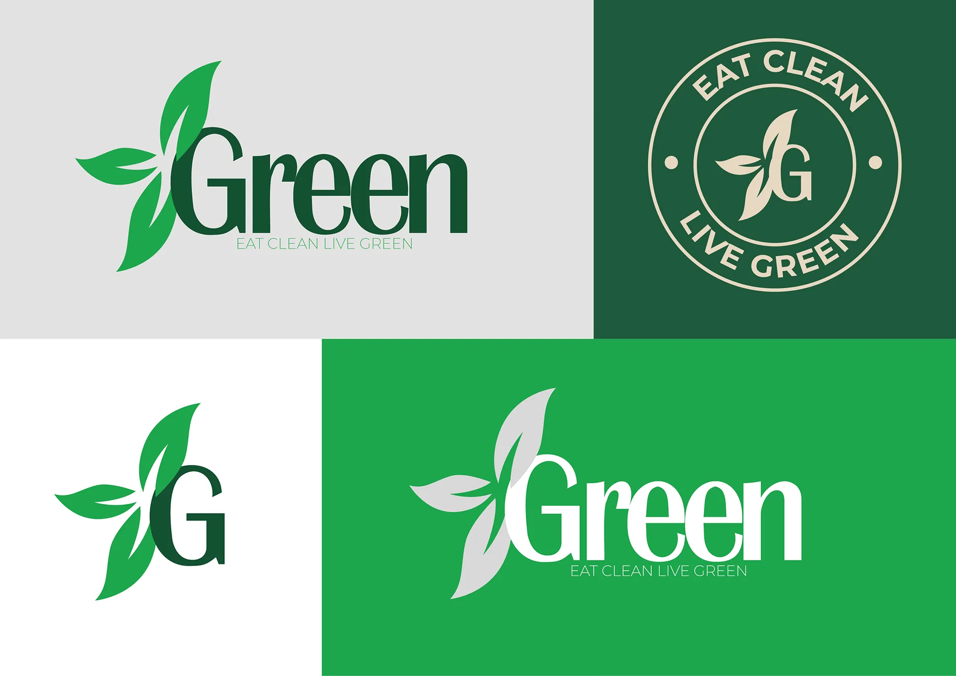
We deliberately worked against the category's conventions: a constructed, legible logotype rather than an illustration, a tight palette, and a label system where product information takes precedence over decoration. Recognition comes from the structure of the packaging, not from a symbol.
The work was as much about information hierarchy as aesthetics. On food packaging, the customer first wants to know what’s inside — the brand registers second.
The system was designed to extend: a single label grid accommodates new references without requiring fresh design work for every product launch.
E-Tadakiry
Let's talk
Have a project in mind?
Tell us about it in a few lines. We reply within 24 hours with an honest first take — even when we're not the right fit.